Joelle's Bakery
Bakery App & Website | Google UX Design Certification Class Project | Aug, 2022
Summary
Problem
Available apps do not offer efficient ways to place group orders for food and drink items. Users have to collect orders from others in various manual ways and are responsible to ensure accuracy of each person’s order.
Solution
Joelle’s Bakery app is the smartest way to order your favorite specialty coffees and bakery items. We make item selection easy for everyone. With an innovative approach to group ordering baked right in, you will be the hero at the office and picking up your order will feel almost too easy. At Joelle’s, our aim is to make your order right and on time - every time!
My Role
Lead UX Designer conducting user research, storyboarding, wireframing, low-fidelity prototyping, useability studies, high-fidelity prototyping, and case study documentation.
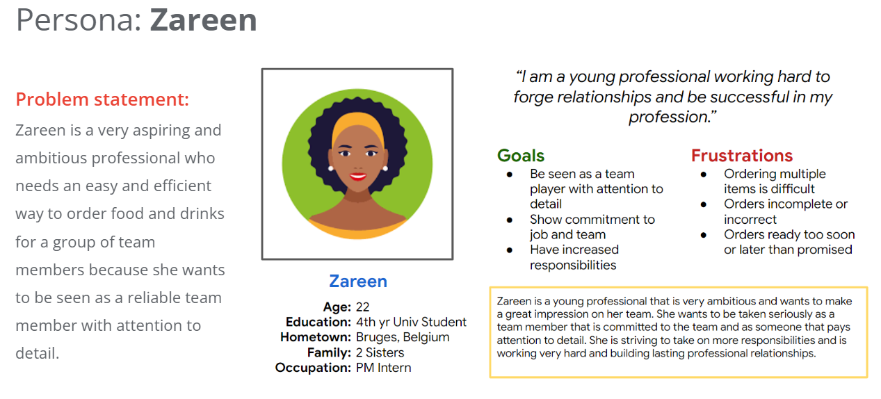
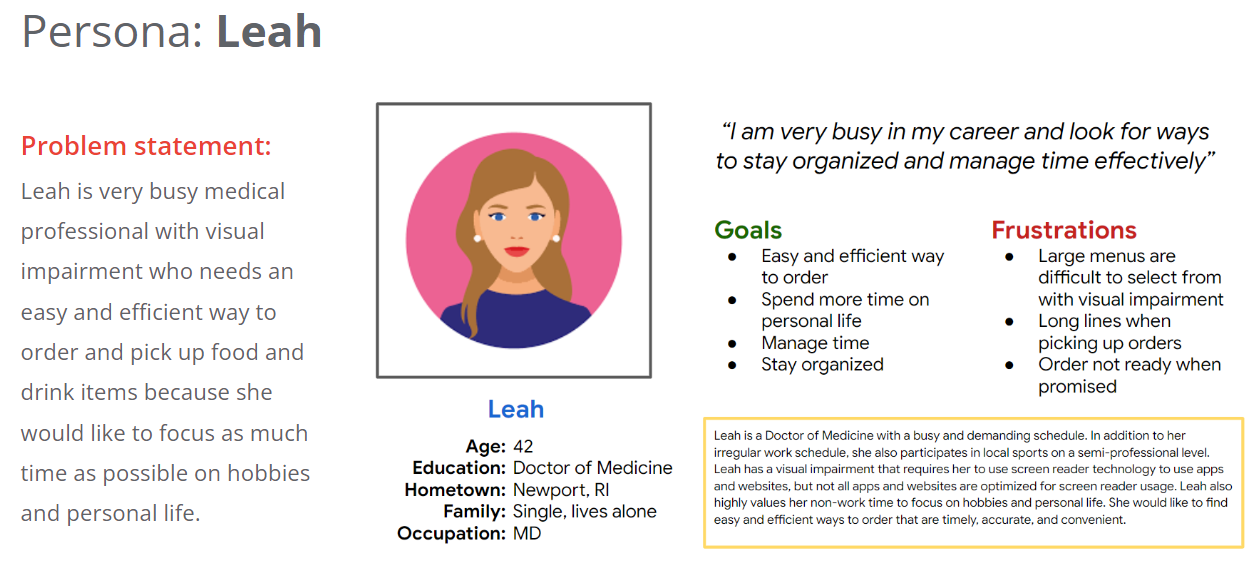
Users & Research
Understanding the User
My research centered around two distinct personas that represented a different segment of users between the ages of 20-60 and order food and drink items at least twice per week. My research led me to two personas that helped us empathize with users that are responsible for group ordering, users that are lead busy lifestyles that are looking for ways to use their time more efficiently, and users with visual impairments.
Ideation
Competitive Audit
An audit of a few competitor’s products provided direction on gaps and opportunities to address with the app and website.
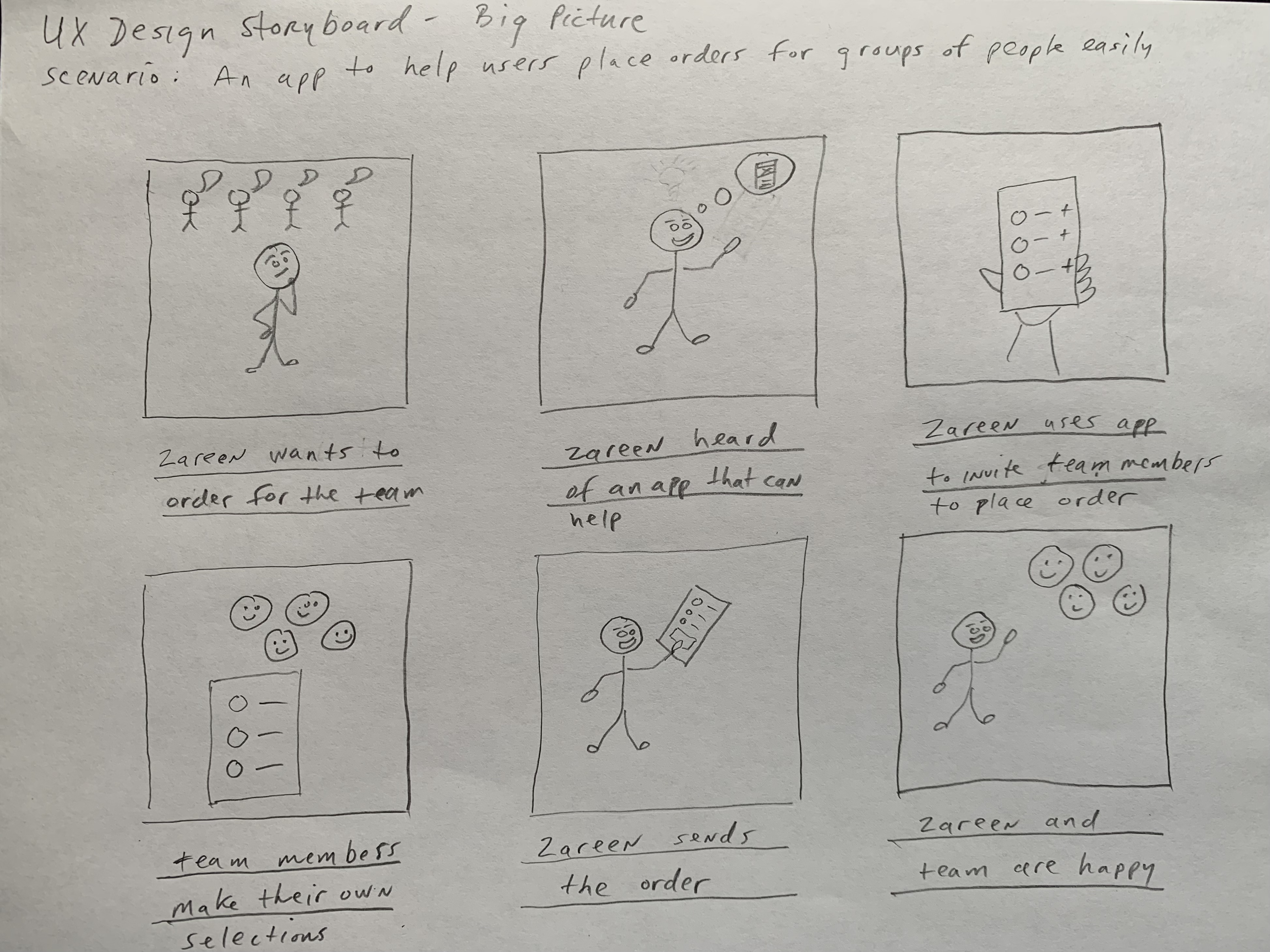
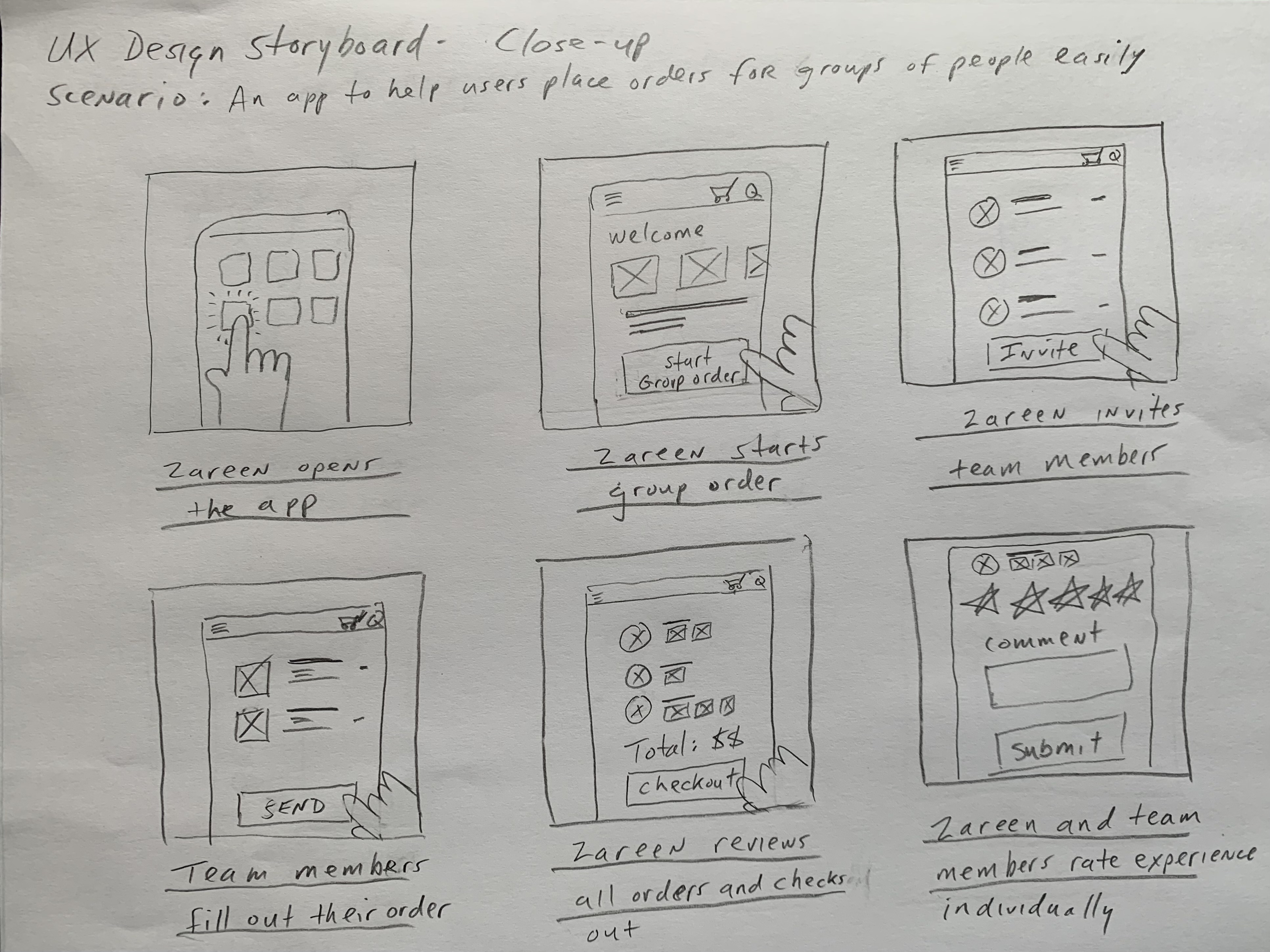
Storyboards
I created a big picture and closeup storyboard.
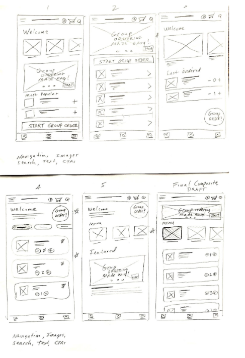
Paper Wireframes
I made several iterations to consider different options for promoting the group ordering feature while also considering the more common use case of single person orders.
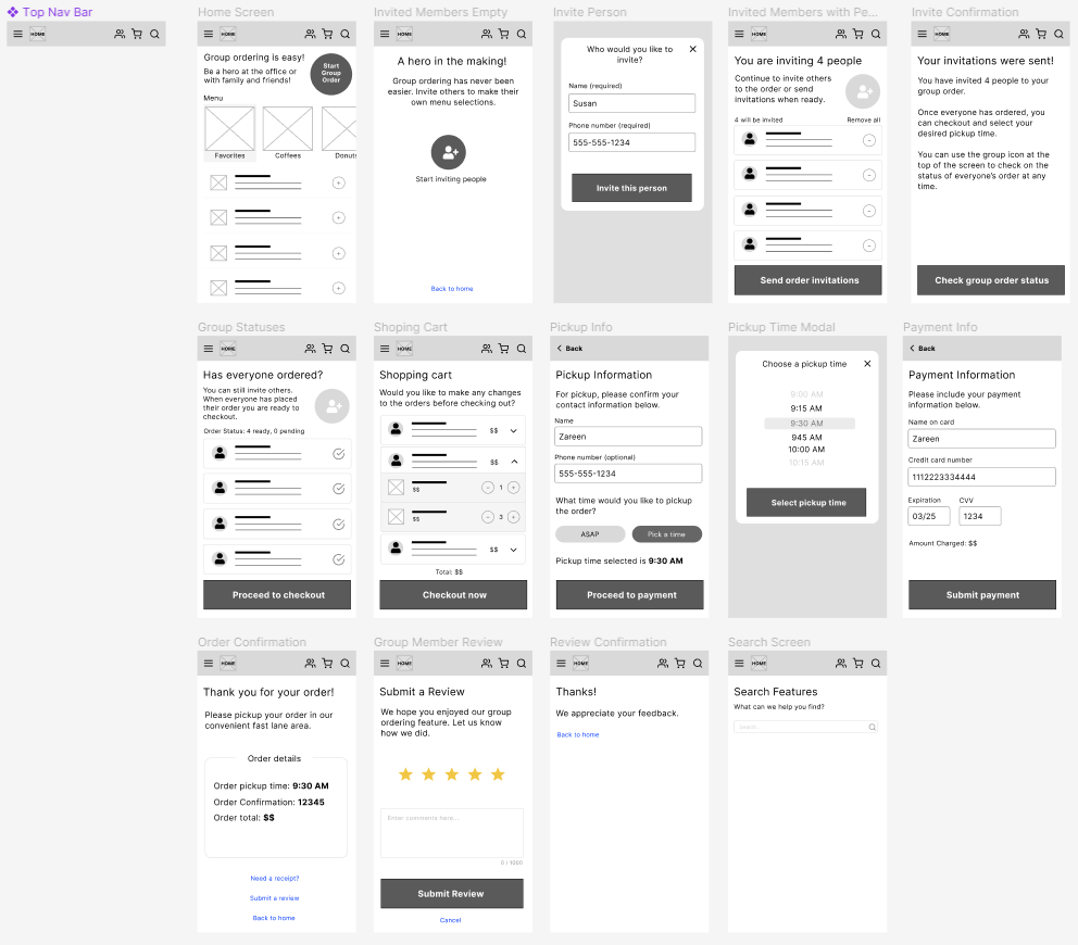
Digital Wireframes for Mobile App
Using Figma, I created digital wireframes as the next step in the design process, focusing on information architecture and structuring the information to match user needs.
Prototyping
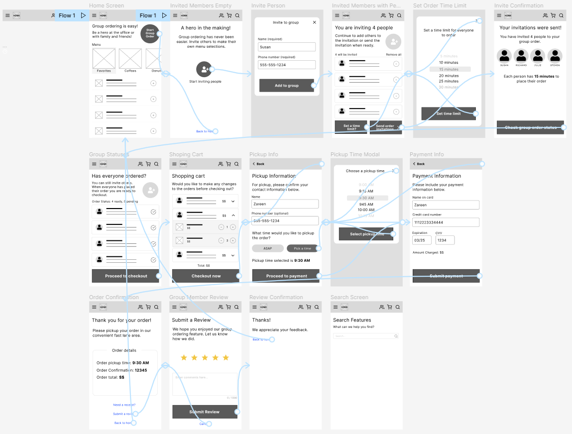
Low-Fidelity Prototype
Building from the digital wireframes in Figma, I created a low-fi prototype to allow stakeholders to test the flow of the design.
Testing & Refinement
Usability Study
I conducted two rounds of useability studies. Findings from the first study helped guide the designs from wireframes to mockups. The second study used a hi-fidelity prototype and revealed what aspects of the mockups needed further refining.
Parameters
- Unmoderated usability study
- Remote users in the United States
- 5 Participants for 5-10 minutes each
Findings
Based on the insights from the usability study, users validated that the information architecture made sense and provided an intuitive flow. Users also requested the following additional features:
- Set a time limit for group members to place their order.
- Users would like to access contacts on their mobile device when inviting group members.
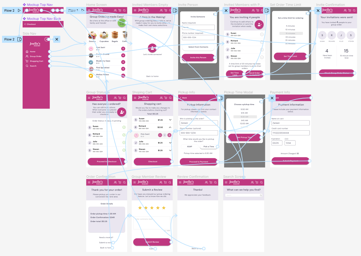
High-Fidelity Prototype
Using Figma, I created hi-fi prototype, factoring in the design iterations from the usability studies.
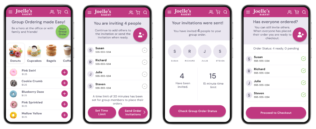
Final Designs
Key Screens from Mobile App Design
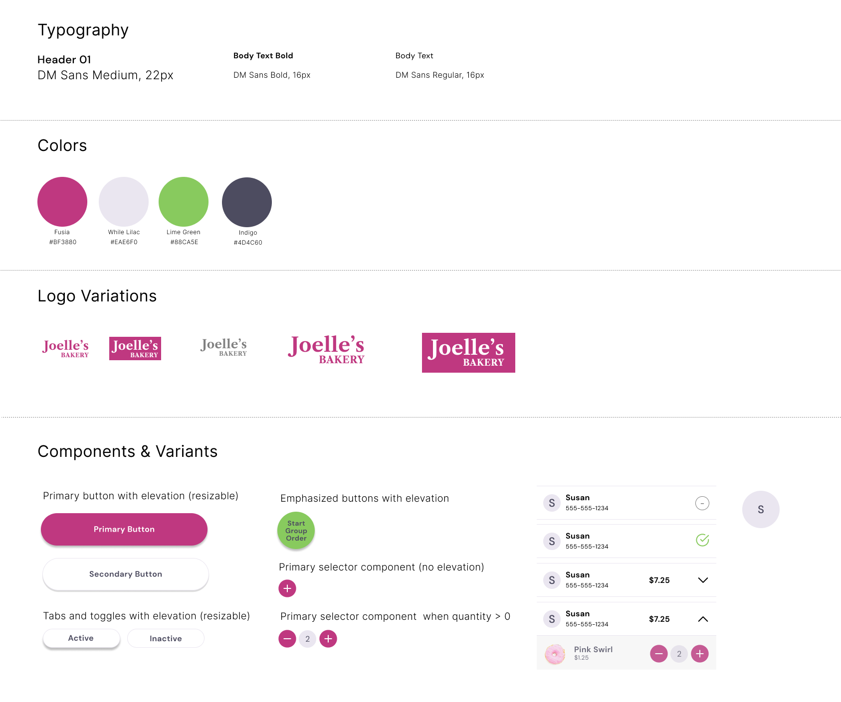
Sticker Sheet
Using Figma, I documented some basic design choices and created several reusable components with variants that were used to build the mockups and hi-fi prototype.
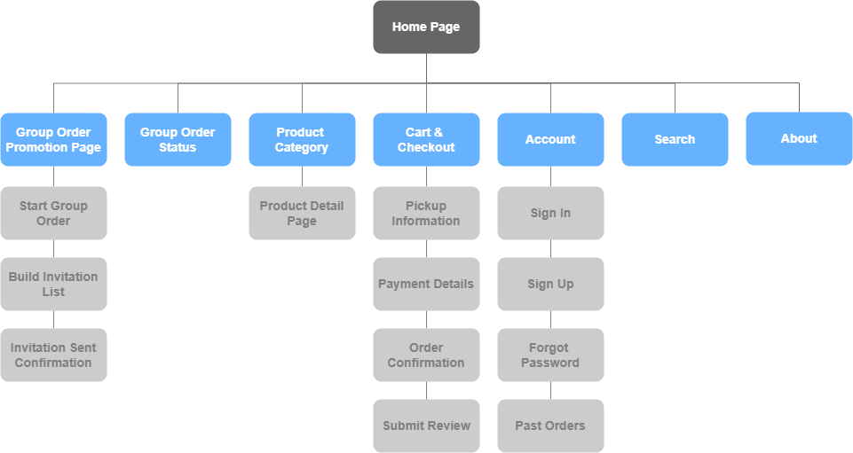
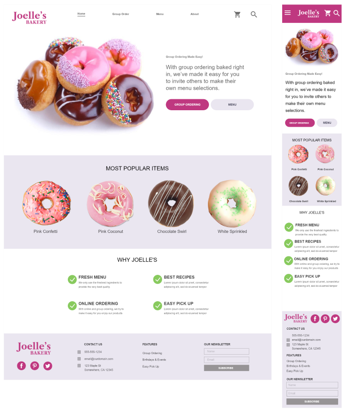
Responsive Website Sitemap & Design
Using Adobe XD and Diagrams.net, the information architecture for this solution focuses on ways the app can address the paint points of users that need effecient group ordering, but not at the expense of more common pain points of individuals placing orders.
Accessibility
The following considerations were included in my design to address accessibility for users with a visual impairment.
- Color contrast was used to promote readability by those with visual impairments.
- Hierarchy and layout were used to help information be visible at a glance.
- Typography used was a sans serif font to create a clean and legible display.
Potential Next Steps for Design
Based on the success of my initial design, these are some potential next steps for the product.
- Adding group members to the order from a user’s device contacts would would make the experience even easier for the user.
- Explore saving group members from past group orders for selection in new or recurring group orders.
- To eliminate the SMS text message invitation, explore ways to invite users to the group order via a push notification to the app on their device.
Key Takeaways
Impact of this Design
Based on user research and validation by users during usability studies, the app helps alleviate the stress of collecting orders for groups of people and addresses common accessibility needs.
What I Learned
While designing this app and companion website, I learned that empathizing with users, useability studies, peer reviews, and design iteration help keep the user at the center of the design process.